

Unlocked — The Handbook Sampler
A free look inside the paywalled posts — featuring expert advice, hands-on tutorials, and a preview of what’s coming next.

Not sure what’s behind the paywall? This free post is your guided tour. I’ve collected extended excerpts of recent tutorials and tips that represent the kind of practical, no-nonsense advice I offer each week. Plus, you’ll get a look ahead at what’s in the pipeline.

On Fridays, I’ve been hosting a one-hour livestream on Substack that’s open to all subscribers — free and paid. It’s a great place to ask questions, pitch topics, and talk shop! Afterwards, I post the entire video here! I also post excerpts on Substack Notes, so be sure to follow me there!
Branding 101 — The social media profile
It may sound counterintuitive, but clear communication beats cute and clever every time when it comes to branding. Your social media profile is no place for jokey talk and ambiguous phrases. Your profile needs to answer three questions...
The Three Questions of Social Media Profiles
Who are you?
What do you do?
Why should I care?
Think about all the work you put into getting your comic seen on social media. You're up against a torrent of endless content. Getting noticed is an uphill battle. You're lucky to get a "like" — and you celebrate every share and comment. When you start to land in a reader's feed regularly, you know it's the result of hours and hours of work.
Now, picture that reader. They're intrigued. "Who is this cartoonist who keeps delivering great stuff to my screen? They go to your social media profile and see what you've written:
"Just three wombats in a trenchcoat! Boy, do I love root beer!"
You've spent all that time — and labor — to deliver them to a place where you can funnel them to the next level of their engagement with your comic. And, instead, you decided to be cute. The reader chuckles, shrugs, and goes back to their endless torrent. And you lose an opportunity to convert a new Patreon backer.
Focus
Instead of cute, it's time for communication. Your social media profile should be downright mercenary in delivering three important pieces of information: Who you are, what you do, and why it's important.

DOs and DON’Ts of Designing Logos
Designing a logo for your comic can be surprisingly daunting. After all, many of us are artists or collaborate directly with artists. However, designing a logo requires a slightly different skill set than designing a comic panel. So, let's talk about some DOs and DON'Ts that apply to good logo design.
DON'T use dialogue font
The dialogue font that you're using for your word balloons is tailor-made for that purpose. It's not intended to be used as display type — and that's what you're looking for in a logo. Beginners make this mistake often — both in logos and in book-cover design. Dialogue fonts don't work very well in these instances.
DO understand the difference between serif and sans serif typography
Serifs are those little marks that are attached to the main letterform in some fonts — like Times. They're there to aid readability in large masses of small text. Sans serif fonts, like Helvetica, do not have these little marks. (Sans is French for "without.")
Serif typography tends to be very formal and a little imposing — especially when used in larger sizes (like a logo). Sans serif is usually more friendly and approachable. Thinking about the emotion you want your logo to convey will help you decide which is better for you.
DON'T work in raster
Your logo needs to be flexible. It needs to be able to be reduced to the size of a postage stamp and enlarged enough to be displayed on the side of a building—and all without a loss in quality. That means you'd be wise to work in vector-based software like Adobe Illustrator. Working in raster-based software (like Photoshop) will limit your resizing options.
DO emphasize contrast
Legibility is key to good logo design — and, in type, that means contrast. You may want to avoid gauzy images and blurry effects. And you'll want your color choices to reinforce the contrast. If you're unsure, convert the image to black and white (or print it out in grayscale). You should be able to tell immediately where your logo lacks the contrast necessary to be legible.

The vertical-scroll eComic
I've advocated converting your comics into a panel-by-panel scroll for smartphone users for a while. I think it's a good reading experience for Instagram, and I think it's a good use of the multi-image post feature on Patreon. If you've taken that advice, then you're already prepping the files, and I have another way for you to use these files. And if not, I will give you another reason you should.
The smartphone edition eBook/eComic
Suppose you've already been preparing your comics for panel-by-panel swiping on Instagram or a vertical scroll on Webtoons. In that case, you already have the building blocks for a smartphone edition eBook. If not, your first step is to convert all of your strips or comic pages into panels.
You can do this simply by cropping each panel, doing a "Save As" or "Quick export as PNG" each time, and then returning to the master file to capture the next panel.
It will be helpful to establish a standard width for each. I use 1000 pixels. Although different widths won't make a difference for actual smartphone users, I have heard from readers who open their smartphone edition eBooks on tablets or desktops. In those environments, the different widths might create a haphazard reading experience.
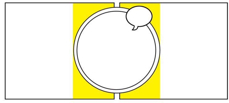
You'll find that square panels and vertical ones convert quite nicely. Horizontal panels are a little trickier, and you might need creative cropping/redesigning to keep your text large enough to be read easily. Likewise, oddly shaped panels — like circles — present their own challenges. I shared strategies for handling both issues earlier…

If you, like me, enjoy doing dynamic page layouts for your comic, you will need to set some ground rules for yourself. For example, I still enjoy using a floating panel between two larger panels. Still, when I do so now, I'm sure to avoid placing text or important visual information in the immediate vicinity (see the yellow zone below). Visuals in that area tend to make for awkward crops.
Establish a naming system that keeps all panels in order. Eventually, you'll be working with them as one big mass of files, and it will be much easier if they're organized from the start.
If you have all your panels as individual files, open Adobe Acrobat and use the Combine Files tool. Drag all of your panels into Acrobat. They will display on your screen in the order you've determined. You can drag individual panels into the proper position if you see any mistakes.
Next, create a cover (using the same width as the other panels) and import that into the first position in your series on Acrobat. If you have any intro pages, this is the time to do the same.
Click Combine.
After Acrobat creates a binder — which is your PDF in its beginning stage, save it. Technically, you could use this as the eBook, but it's bound to have a rather large file size. So go to File -> Save As Other -> Optimized PDF. You can use the default downsampling ppi for color images (150), but I bump mine up to 200.

Coming Soon…
Here’s a look at what I’ve got lined up for upcoming posts. These are topics pulled straight from reader questions, real-world challenges, and the trenches of comics-making. If any of this sounds like something you need, now’s a great time to jump on board.
Talking Comics: Understanding the Kickstarter Ladder
Tutorial: Making a vertical-scroll eComic, step by step
Rethinking the Landing Page
Webcomics Confidential: Finding Your Motivation
How to Do a Reader Survey (and Why)
Avoiding Unnecessary Tangents