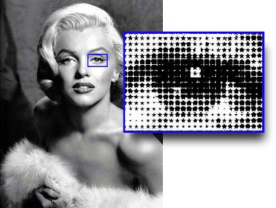
Originally, a halftone screen was the only way a newspaper or magazine could print an image with a continuous tone — like a photograph. A halftone converts grey tones into little black dots. Unless you’re looking very closely, your eye reads these dots as shades of grey. Manga has made halftone screens cool again. However, navigating halftone screens requires a fair amount of printing savvy.
SOURCE: The Print Guide
♫ When the moon hits your eye… ♫
A moiré pattern in a halftone screen occurs because our eyes are always trying to find patterns.
The only way I know to address this is by loosening the line screen — measured in lines per inch (LPI).
By lowering the line screen, the dots get further apart, and it's harder for your eyes to create patterns.
In Clip Studio, you can do this by decreasing frequency and density in the layer property subtool of a monochromatic tone.
In Photoshop, the best strategy I'm aware of is to avoid converting those grays into halftones until you've resized your comic to the final size it's going to be printed.
If you make the halftone screen and then reduce or resize that comic in any way, that moiré pattern is going to occur.


